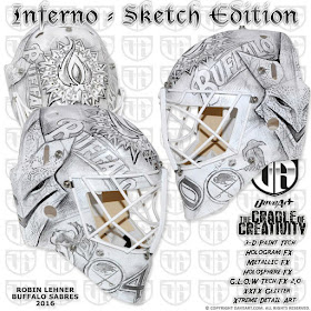
I was at the Calgary Flames game tonight and was struck by what I saw in the opposition net.
I usually am curious to see what goalie masks are being sported and if I like them or not. To me, a good looking goalie mask should be one that can be appreciated both up close and from a distance. But in Robin Lehner's case, I had to do a little more digging as you will soon realize.
No, I didn't desaturate the photo, this mask is completely black and white. Can something so devoid of color be considered bold? Possibly.
My first thought was that of another goalie who went sans color in their mask design...Tim Thomas. In fact, he was my very first "Rate My Mask" card and a quick peek shows that I gave it a 4 out of 5. But many of you didn't feel so kind to it at the time.
We'll see how you feel about Lehner's.
Drawn up by mask design guru David Gunnarsson, this creation is entitled "The Cradle of Creativity" and is inspired by Robin's favourite band - In Flames. We will get to some of that detail in a moment.
You can clearly see the Buffalo text running down each side of the mask with the In Flames logo on top. The Sabres logo is on each side of the chin with the number 40 smack dab in the middle.
On the left side around the ear you will see what looks like a crow. That part is inspired from In Flames' album cover for 'Sounds of a Playground Fading'. It's quite small and doesn't really have the killer detail that the album cover has.
I like the artwork of this album. And seeing this makes me understand more why it would work on Lehner's mask as a sketch. I just don't know if the mask detail is as solid as it should be.
Now before I go any further, can you guess what music genre In Flames belongs to?
I'll give you a hint......you're right.
It's kind of catchy but it doesn't really do it for me. But then again I've only listened to about a minute of their stuff. First impressions....they can be a killer.
Anyways, back to the mask at hand.
The right side design, again by the ear, is....you guessed it, more album artwork inspiration. This time from the 'Come Clarity' title.
Again, I can see why Gunnarsson went the sketch route. But just like the other side, the detail of the album cover isn't quite as effective on the mask. It just comes up short.
I don't know if that is because the artwork is so small (and actually pretty insignificant) in the overall design of the mask or that is really does look like a rough sketch drawing of it. Regardless, it doesn't work for me.
Lastly, the rear panel sections of the mask showcase the mascot for In Flames. This time, the detail is pretty effective. It's got that maniacal laugh vibe that really puts some character into the mask.
While I enjoy masks that have an inspiration, theme or direct tribute, I do feel like there needs to be some character to the lid or it's nothing more than plain artwork. And as detailed and impressive as it might be, if it lacks that soul...it really doesn't do anything.
The mascot depiction definitely adds to the mask. In fact, I'd almost say that it saves it from really tanking in my overall rating.
So how did Gunnarsson and Lehner come to the decision to go with a sketch look? It seems that the pair just got talking about how much they liked sketches and then Lehner mentioned that he wanted his mask to be like nothing ever done before. He wanted to be completely unique.
He's got points in that category.
But is it enough to really impress? When you pair it up with his dark jersey colours, the mask seems a little out of sorts. Tonight when I saw him in net, the Sabres were wearing their road whites so it worked a little better. That said, from a distance you couldn't really appreciate any of the design. He looked more like a goalie who had to resort to the "I just got traded" white mask (now those are some sweet mask looks).
Overall, I like the attempt and the reasoning, but I just can't give it top marks. It's not as detailed as I'd like in some areas and the "wow factor" is just not there when sitting in the stands.
2.5 out of 5
Now it's your turn to RATE MY MASK!!
BTW.....German Heavy Metal is the right answer.


They're actually Swedish :). I used to listen to them a lot around the time Come Clarity came out. I think the mask looks pretty interesting, but from a distance it would look pretty plain.
ReplyDeleteWhat??!!!! The internet lied to me.
DeleteThanks for the clarification Eugene. Hope you had a good summer!!