
Dipping a little ways back to the tail end of the "junk wax" era, I found a set that tried to be different. It succeeded...but that's not always a good thing.
In 1997, Pinnacle was throwing everything at the consumer in hopes that something - anything - would stick. It wasn't much longer after that they would decide to close up shop for good. This is one of their lasting products that just makes me shake my head.

1997/98 Pinnalce Inside
Executive Collection
First of all....these cards didn't come in packs - they came in cans. That's right. You'd get a can of cards that you would have to open with a can opener and yank out the goods.
The concept of Pinnacle Inside was that these cards would get you "inside the game". How did they do that? Well by not showing any action shots in the cards. Warm-up shots, standing at the bench shots and my favourite...just before the faceoff shots.
A more exciting group of photos would be hard to come by.
And what's better than just a regular set of boring base cards? How about TWO parallel sets. The Coaches Collection and The Executive Collection.
That's 190 cards worth of awesome.....times three. Actually, the parallel sets only have 90 cards to them each. I will spare you with the math....still too many bad cards.
It doesn't matter how you try to break it down....not impressive.

The layout of the card is very "boxy". Borderless, the main photo takes up a good chunk of the card front. A second picture is squeezed into the left side along with the team name and position. Just the last name appears on the bottom of the card (in a hideous font) and the Pinnacle Inside logo is in the top right corner.
Because this is the Executive Collection parallel, that moniker is stamped on the lower section just above the name.
The card is thick in stock and has a prismatic foil coating on it. The logo, last name and parallel moniker is foil stamped as well.
Seeded in 1:57 packs, these were a very solid pull back in the day. Some of the cards book for decent money, but at the same time - book value doesn't mean squat. Especially when it comes to older non-memorabilia inserts.
Yes it's shiny, but that's about all this card has going for it right now. Let's take a look at the back.
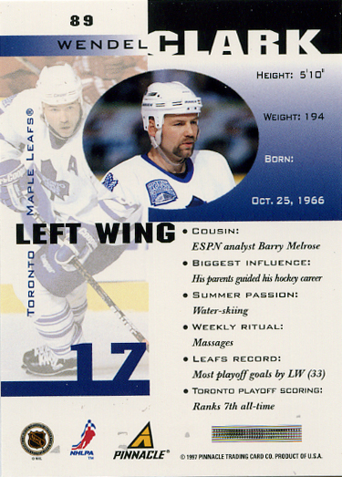
As you can see, rectangles rule the back of the card too. A third photo is introduced in said oval and Wendel's full name appears at the top of the card.
Vital stats (I'll bash this in a second), team, position are haphazardly placed all over the place and the number 17 also makes an appearance. Why not. It matches the number 89 at the top of the card.
What I really get a kick out of with the vitals is that there are four lines worth....but only three stats. It appears the word "Born" needs its own line. C'mon! That's just horrible designing. It's as if Pinnacle was at the mercy of the oval. "I just can't fit it in!" Brutal.
But the best part might be the complete avoidance to any statistical information at all. I don't need to know about goals or points or penalty minutes. I'd much rather know that Wendel has a weekly ritual of "Massages".
Thanks.
Logo litter the bottom of the card and that about wraps up this lovely debacle.
As I mentioned off the top...Pinnacle tried something different. They changed things up. Can you give them points for trying? In this case - no.
Sometimes you shouldn't change things just for the sake of change. Create something with purpose - with a vision.
There was definitely no vision here. Eyes closed....all the way.
1 out of 5 (only because it's shiny)

Haha! Those do look crappy! I've never seen them before, but I actually have an unopened can in the basement somewhere. Picked it up years ago because it was cheap and had Gretzky on it. Guess I won't be tempted to open it anytime soon after that review.
ReplyDelete