Saturday, March 31, 2012

'DID YOU KNOW' - The Russians Are Coming!

Anyone up with hockey these days knows the names Ovechkin, Malkin, Kovalchuk......the list goes on.

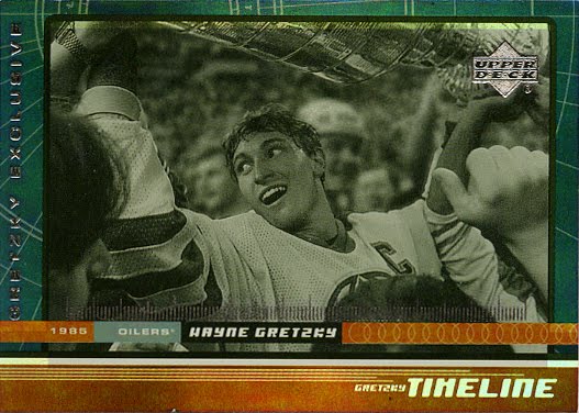
Most of you know the names Fedorov, Larionov and Makarov.

But how many of you know the name Sergei Priakin? Or how about Victor Nechayev?

If you don't, stick with me and you'll get to know them.....and how important they are to the NHL.

DID YOU KNOW: Sergei Priakin was the first Russian player allowed by the Soviet Ice Hockey Federation to play in the NHL.

First of all.....yes, this is a first year Pro Set card.  And yes, you can learn interesting and valuable things from Pro Set.

It was 23 years ago today that NHL history was made. The Calgary Flames gave the 25 year old winger (drafted 252nd overall in 1988) the opportunity to play late in the season after his team (the Soviet Wings) completed their season.  It ushered in a new era of international player to the NHL scene.

In the late 80's, Soviet players were regarded as an outside force.  Russian-born players in the NHL up until Priakin's debut were almost non-existent (some played without permission).  The S.I.H.F. was in a transitional period as the 90's began (it wouldn't take long before more players came over to North America to test their skills in the NHL).  For Priakin, this was an opportunity to prove that not only did he belong ....but so did players of his nationality.

Because it was so late in the season (and the Flames at that time were a powerhouse team), Sergei's impact was not quite as powerful statistically on the ice.  He tallied just 2 penalty minutes (and nearly had an assist) in the pair of games he played in before the playoffs.  He suited up for one post-season tilt.

Remember, it was 1989....the year the Flames won the Stanley Cup.  And although Priakin didn't qualify to get his name engraved on the trophy, he did receive a Championship ring and posed for the official Stanley Cup team photo.

Not bad for a guy with that much pressure on on his shoulders.

In three more seasons with the Flames, Sergei Priakin played in just 46 regular season games scoring 3 goals and adding 8 assists.  And while many see his NHL career as just a blip on the radar, his impact on the league is still felt to this day.

Sergei had a pretty solid overall career (and he had some amazing hockey experiences).  He was a part of the 1982 World Juniors, the 1984 Olympics, won a gold medal in the 1986 World Championships, played in the 1987 Canada Cup and Rendez-Vous '87.  There are a lot pro hockey players that can't read off a resume like that.

He finished off his pro career in the late 90's with Swiss and Finnish teams (and even played a few games for a league in Japan).


Now I said that he was the first Soviet player to play in the NHL with permission from the S.I.H.F., and I mentioned that there have been players before him from Russia to play in the NHL.  So who was the first ever Soviet born player in the NHL?

That distinction goes to Victor Nechayev.

If you haven't heard of Sergei Priakin......you surely haven't heard of Victor Nechayev.

Victor was drafted in the 7th round (132nd overall) by the Los Angeles Kings in the 1982 Entry Draft.  NHL teams in those days would use their late round picks to draft Soviet players on the off chance that they would be able to get permission to play in North America.  A great example of this would be legendary Soviet goalie Vladislav Tretiak.  He was drafted in the 7th round by the Montreal Canadiens in 1983 and then GM Serge Savard travelled to Russia multiple times in an attempt to lure Tretiak over to the NHL (sadly with no success).

Anyways, back to Nechayev.  He was drafted in 1982 and made his debut in 1983 (he was not deemed an elite player in his homeland and as a result there was not a lot of resistance in his move to the Kings.  He played in just 3 games and managed to pop one goal.

It seemed so insignificant at the time, but that goal and his suiting up for the Kings started the trip down the path.  A path that would allow a number of amazing Russian players to play in the greatest league of them all.

Now you know.

Thursday, March 29, 2012

OUTSIDE THE BOX - You Want The Best...You Got The Best

That's right....it's the hottest band in the world.

And I bought a blaster box of their product last summer.

And it sat on my desk for months.

And now I'm finally getting around to sharing it.

Trust me....it's not so hot.

'Kiss 360 Degrees' was produced by Press Pass and this set was released in 2009.  I was at the Farmer's Market last summer with my niece and thought it would be fun to buy a blaster box.  It was on sale.

And it still came off as a bad buy.

In the back of my mind, I thought I would have the longshot chance of pulling one of the Rock Star Relics (memorabilia) or Kissignatures (cut autograph).  Clearly I was delusional.

12 packs.  5 cards per pack.  Do the math....that's 60 cards.

So let's look at some of the 'goodies'.

Some of the cards do have nice photos while others seem to miss the mark a bit.  There's a mixture of on stage, behind the scenes and studio/portfolio shots.  I'm more of a behind the scenes kind of guy (and I'm definitely more of an original lineup fan).

Gene playing tuba......nice.

These Snapshot inserts are on a thicker see-through plastic card.  Nothing fantastic...unless you consider a stoned (or tremendously confused) Gene trying to figure out whose kid he's holding.

Pssssst......he's yours.

The Albums subset are not bad, but only if you pull the vintage albums.  Crazy Nights, Animalize and Asylum do not count as cool.

The one aspect of these cards that I do like is the flip side.

You can go old school and make a pair of 9 piece puzzles.

This classic pic of the band takes me back to my youth when the band was believe it or not.....scary.

Not like today where it literally is a circus.

Ooooooooooh.  Parallels.  I got a couple Blood Splatter parallels.  These are truly the high end pieces of cardboard.  I will be sure to put these into toploaders (or even one touch cases).  Sweet.

I especially love the Paul Stanley possessed pic.  I'm betting that's a premium priced card.

And I bet that's not mouthwash Ace.

Scab!  Scab!  Scab! 

Go back to you old job as Kiss video editor Tommy Thayer.

Probably the best photo in the box.  The Double Pistol (pew pew).

This is not cool.

If you're a fan of the band, this might appeal to you.  But I think Kiss 360 Degrees just doesn't offer enough bang for your buck.

Did I just do that?  Yes I did.  Thanks Paul.

Wednesday, March 28, 2012

ARTICLE - Is The Hobby Dying?

This news story aired on CBS Sunday Morning recently and created quite a bit of dialogue within the collecting community.  Before I get into my thoughts, take a few minutes to watch the piece.


Now it would be impossible to accurately show the 20-25 year history that the sportscard industry has gone through in a 4 minute piece.  A lot of what was said just scratched the surface of what this hobby was, is and looks to become.

Some things that caught my ear....

"The youth are missing."  You know what - they are.  And why is that?  Is it because the industry has changed so much that it's priced the youth right out of the market?  Is it that the kids are just not interested in sportscards?  Or maybe they aren't 'missing', just smaller in representation?

I think it's a bit of all three with other factors coming into play.  At the end of the day, I believe this hobby is geared more towards the 16+ crowd.  I don't know if there is anything that can be done to capture the youth movement in huge numbers.

I don't think the card companies have done anything to help that 'concern' (if you could call it that) either.  After all, they do cater to those with a little deeper pocket than a 8 year old.

Case in point, this CW33 story (that Panini posted on their blog as a response to the CBS story and the notion that the 'hobby is dying').


To Panini, not only is the hobby not dying....it's radically transforming  for a new generation.

In my opinion, they're right.  Transforming for a new generation of people who can afford the cards.  Did you notice in the second story that all the footage of cards used were 'hits'.  I didn't see a single inexpensive card in the lot.

They say it themselves...

"Of the 60+ sports products Panini America produces in a year, 10% are targeted to kids.  This is no longer a wax/bubblegum category.  Males 18-55 drive the category."

So the youth are missing.

I'll admit, I was surprised to see Panini take such a stance against the CBS story.  They seemed almost insulted by it.  While I don't think the CBS story dove deep into stats and such, I do feel like a good chunk of what they said had some merit.

Again, it's a 4 minute news story....not an hour long documentary.

Panini even went so far as inviting the reporter to be a guest of Panini America at the upcoming National Sports Convention in Baltimore.  To me, a giant show like that is just as much of a misrepresentation of the health of the sportscard industry as the card show shown in the news story.  Giant annual shows are a beast that most people don't have the way, means or money to attend.  So how can these shows represent the broad cross-section of the hobby.

They can't.

Speaking of shows, in the CBS story, a comparison is made between a current day card show and a show that occurred in the mid-1980's.

First, I'd like to say that yes, sportscard shows just flat out aren't the same as they were during the boom of the late-80's/early-90's.  Did you notice that the current day show occurred on a weekday?  Attendance would surely be down for something like that.  Optically, it's going to look like night and day no matter what.

What I find most unfortunate is that I love card shows.  I love them even when they aren't busy.  Why?  Because I get to 'talk shop' face to face with other hobbyists.  Because I get to window shop for cards I'll never own.  Because I get to chase those cards still making a dent on my wantlist (holding out hope I'll find one).  But mostly because local monthly card shows are truly what's dying in the hobby.

I predict that in less than 10 years, monthly card shows (in most cities) will be a thing of the past.  Ebay, online forums and hobby boards have taken over the secondary sales element of this industry.  I cringe for the day when I no longer have a show to go to.

Sure, those giant yearly shows are still there (and will still exist), but not everyone can fly in from out of town to go hunting for hockey cards.

While I felt the CBS story was lacking in real teeth when it comes to the subject of sportscards, I was especially disappointed at one of the reporter's last comments.....saying the cards on the table were "worthless".

What a blanket statement to make.  They're worthless to Armen Keteyan (who I've got good money on that he's not a card collector).

All cards have worth.  Not all cards are worth something to everyone though.  To me, a Linden card is worth something.  To the next person, it may be worth nothing.  So who's right?  We both are.

Thanks for that 'objective' statement Armen.

The final phrase I was left with from the story was "kids don't care".  Again, I feel that's a bit of a blanket statement.  There are kids who do and kids who don't.  There kids who collect because it's fun and there are kids who collect because it's profitable (it's a business as opposed to a hobby).  Hey, they learn by watching the adults.

At the end of the day, I feel that the hobby is not dying.  The hobby is evolving.  This is my hobby and I'm not letting it control me.  I dictate how I want this hobby to work.  I buy what I want, I ignore what I choose to ignore.  It's up to me.

Just like it's up to everyone else when it comes to their own personal hobby enjoyment.

If the feeling that kids need to be attracted back into the hobby, then the card companies will have to work to make that happen.  But I just don't see that happening.

I could go on a lot longer, but I'll leave it for now.  I might come back to this subject later on down the road.  For now, I will leave you with this final thought.

To me, a news story is an opportunity to ingest some information about a subject and then come up with your own conclusion.  Don't believe everything you see and don't discard everything you see either.  News stories should create thought and create discussion.  They should help you form your own opinion rather than you just believe everything that is said as truth.

What are your thoughts on the news stories?  What are your thoughts on the health of the hobby?  Have you seen any other hobby related news stories/documentaries that made you sit back and think?

MAILDAY - Oooohhhhhh.... Redemption Time

I received a bubble mailer from Panini today. You know what that means - redemption card redeemed.

Now before you get all excited and jump for joy over what surely will be a historic mailday post, I'd like to point out that this is no ordinary redemption. It's an actual 'pack pulled' goodie from yours truly.

I'm not the biggest fan of redemption cards. I understand that they are a necessary evil in the hobby and a lot of times your wait is worth it when you see the end result. In this instance though....I think not.


2011/12 Panini Certified 
Freshman Signatures 
#177 Lance Bouma 

That's right! Number 57 in your programs but number one in your heart..... Lance.....Bouma.

 Bouma.

Now I am completely perplexed as to why this card is a redemption. The only possible reason I can think of is that when the product was produced, they didn't have a finalized checklist of rookies. Still, it just feels like it's not worth going through the process just to have this arrive at your doorstep.

I'd love to see something developed with regards to redemptions. Sort of a 'swap & go' mentality. If you don't want your redemption, you can trade it in for a card of equal or lesser value from a list of cards. That card would then be sent to you instantly (as the list available would only consist of ready to distribute cards).

The cards could be from the current season and even years past (it'll get rid of some of the older junk in the back of the closet). At the end of the day, I just don't feel like I've 'won' anything (and in my warped world....redemptions = winning something). You're getting something that wasn't there when you opened the pack.

Yes.......I'm just whining about landing a Lance Bouma card.

Bouma.

At least he signed it (that's right - it's hard signed.....or should I say hard scribbled).  Woo hoo.

Nope......still not impressed.

Bouma.

Sunday, March 25, 2012

LINDEN CARD OF THE WEEK - 99/00 Pacific Prism Holographic Blue

I know, I know. I've been posting a lot of Linden cards lately. But when this one hit the mailbox on Friday, it not only concluded one of the unlikeliest of finds - it knocked a big 'white whale' off my list.

For the record, a 'white whale' (a card that has been on one's wantlist for quite some time) is not a card from a couple years ago. Just because you REALLY, REALLY want it and you've been waiting for months..........nope, not a whale.

I'm talking 8-10-12 YEARS of searching, waiting.....hunting. That's what a 'white whale' is.

And it's a great feeling to be able to cross one off the list.


1999/00 Pacific Prism
#73 Holographic Blue /80

You'd think a card with 80 copies would surface more than once a decade. But no. This card has eluded me for a long time. Just a quick note...it's got a very blue sheen to it which did not show up in the scan at all. Weird.

The funny thing is, it wasn't an ebay find, it didn't come from one of the other Linden collectors and it wasn't stashed in someone's "to be shipped" pile knowing I collect Trev.

This card came from a website that I've perused only a couple of times before. Centre Ice Collectibles.

It's a marketplace for hockey cards. It's got a decent selection (and OK prices....especially if you find a whale like this). But to find a rarity for a player collector is a longshot.

I guess longshots occasionally pay off.

This card was a no-brainer to be put in the 'to be purchased' basket. I really didn't care what the price was (for the record - $5). But knowing I was going to get this one, I thought I'd take a closer look to see if I could add to it....since the shipping wouldn't go up anyways.

Wouldn't you know it, I found some Linden cards that were part of a deck of NHLPA playing cards back in 2005. Now, I'm sure if I searched hard enough, I could've found the whole deck for less than the price of the 4 Linden's I picked up, meh...it was a great find.

So that's 5 Lindens in one shot. Not too bad. I'll be checking out this site a little more often.

Now that I have all the copies from this parallel-hell product (thanks for that Pacific), I thought I'd show them all off.


And they actually, as a group, they scan pretty nice. Here we have the...

Holographic Gold /480
Holographic Blue /80
Base card (yes, I scanned them backwards)
Premiere Date /69
Holographic Purple /99
Holographic Mirror /160

I have absolutely no clue what Pacific was thinking when it came to this debacle (weird numbering and weird names), but now that I have all 6 - I kind of like it.

Now to go catch some more whales.

Here fishy, fishy, fishy (yes I know they are mammals).

SCRIBBLES & SCRIBES - Prized Prospects

"Prized Prospects"? Plural? Possibly.

If you're talking about on-ice talent that is.

But when you're talking about signatures, there's only one in this pair that is worthy of the distinction.

It's never tough to find a scribble when it comes to the chicken scratches that are laid out by hockey players these days (especially the new crop of talent). The limit of posts for this subject comes from the lack of quality signatures to choose from when you're talking about today's fresh-faced NHLers.

But I search them out......and I'm determined to find them.


Lukas Kaspar
SCRIBBLE

I chose Lukas' signature because it's a little different than most scribbles out there. This one has a sort of 'method to the madness' feeling to it. It certainly is a busy bunch of pen strokes.

I start to make something out of it (or at feel that I do) only to drift off and get lost in the maze of blue ink.

I gave up and deemed it a solid choice for this post.


Matt Carle
SCRIBE

Matt (or should I say...Matthew) has a very legible signature. So much so that I would almost not categorize this as a signature. Rather, a printing of his mane.

I'd be curious as to how he just writes or prints on a regular basis. Filling out forms, doing paperwork, etc. I bet it's pretty similar.

That said, it's rare to find something as crisp, clean and purposeful as Carle's offering is.

Normally, a rookie to the league hasn't been inundated with requests or bombarded with card company contracts. Often, this means that a slower, more refined signature is prevalent. Remember Carey Price's drift into Scribbledom.

Happens often.

This Prized Prospects signature comes from Matt's rookie season. Now take a look at how it's deteriorated once he's been in the NHL limelight for a bit.


Thought so.

Thanks for solidifying my stance that most players today just don't have the time to give fans a solid, quality signature.

Looking forward to seeing what we'll get from you in the future.

Thursday, March 22, 2012

OPINION: COMMUNICATION

I've been thinking about how to express my thoughts on this subject for the past couple of days now, and I had a good handle on what I was going to say.....until I had a couple beers with a buddy of mine tonight.

That's changed my approach a bit. I'm going to look at it from my point of view (since it is after all....my opinion), but I'm also going to take into consideration the other person's potential point of view.

To me, communication is THE SINGLE MOST IMPORTANT COMPONENT when conducting any sort of transaction, purchase, trade, what have you. Be it in person, via hobby boards, on ebay, anywhere. Period.

To me, letting the other party know of your intentions, actions and experience when it comes to a deal is paramount. I think that when entering a transaction with another person (or even in the initial discussions), prompt, courteous communication needs to occur from both parties in order to severely minimize any future bumps in the road.

I also think that it's common sense and a common courtesy.

Now, before I continue, I will openly state that I'm not batting 1.000 when it comes to this. I realize that I'm not perfect. But I do feel that I've got a very respectable batting average.

So why am I bringing this subject up? Because in the last month or so, I have experienced about 7 or 8 instances where (what I feel is) less than adequate communication has occurred. And at times, it has left me trying to figure out the status of the transaction.

I feel that if I say I'm going to send something out by a certain date - that I do so......or I communicate to the other person that I've been delayed. I also expect the same in return.

I'm in no rush to receive my end of transactions (unless I'm being charged extra for the prompt shipping). I do however expect to be notified if there's a delay in my item, money, customs to be built, whatever in being mailed off.

Why? I think it shows that the person is 'keeping up' with where the transaction is at, and I also think it shows a level of respect for 'the process'.

By not communicating, by not keeping track of what is going on, by not answering concerns I might have, it shows me that you are not concerned.

And that concerns me.

Again, I don't care if you take 3 months. But keep the lines of communication open. Let me know what's up.

That said, if it's taking 3 months........why? There's a big difference between "something came up and I was unable to" and "oh, I forgot" or "I didn't realize that......(enter reason here)".

More often than not though, I've been the one having to ask what is going on.

Now, in looking at it from the other side, I feel it is one of two things. I think there are those who feel that nothing is wrong since I haven't said anything about it. Fair enough. I think that it is my responsibility to express my concern about the bigger issue of communication should it be starting to manifest itself into a potential problem.

I also think that there are those who just don't care enough. Call it lazy, call it a low priority. It just doesn't matter. Or maybe it's that the other person doesn't have that expectation bar set to the same point as I do. Is there a 'right spot' for the bar? I don't know. Like I said earlier, I'm not perfect either.

At the end of the day, it's a hobby. And hobbies should be fun. Will anyone die if I don't get my card by tomorrow? No. I should hope not. Will it be the end of the world if my card gets shipped out 2 weeks after I pay for it? Nope.

But the hobby is more fun when things are a little more on the same path. And that road is definitely a two-way street.

Thanks for letting me communicate that.

Tuesday, March 20, 2012

LINDEN CARD OF THE WEEK - 2011/12 Heroes And Prospects Memorabilia

One of the questions I asked myself when Trevor Linden retired was "How long will it take before In The Game includes Trev in their 'Heroes and Prospects' product?"

You must remember, at the time of his retirement, Linden was rarely included in any company's sets and so the desire to have more cards to chase was much higher than it is now.

Of course, 2-3 years later and I almost cringe when I see the checklists of new products (more on that in a moment).

I was really happy though to see Trev included in this season's H&P product. It was about time. I was even more happy to find that his inclusion was a very modest (and wallet friendly) 2 cards.


2011/12 In The Game
Heroes and Prospects
#HM-10 Heroes Memorabilia Silver

This is the 'easier to find' card of the two in the set (the 'tougher' one is the gold version - which is limited to just 10 copies). This silver version is 1 of 60.

I don't know what it is about the card, but I really like it. I love the photo (considering ITG can't use NHL logos). The old-school Cooper helmet is my fave. The design is simple and really effective. And it's a generous-sized piece of memorabilia.

It's just a sharp looking card.

I really like that I was able to land a 2-color piece of jersey as well. I had seen a couple go on ebay previously and was worried that the well had run dry on the premium pieces. I had even tried to get a single colored swatch a couple times, but was patient not to overpay.

This card popped up with a very reasonable 'Buy It Now' price and I scooped it up right away.

A quick note to all of you about shipping your cards now. When I received my package, I noticed the card was in a toploader that was one size too big. Thus, the card could easily (too easily) slide in and out - not good when you're mailing it.

So what did the seller do? He taped the top of the toploader. Problem solved right? Well, unfortunately one of the corners kind of wedged out causing a tiny bit of damage. Not enough for me to ask for a refund or anything, but enough to make the seller aware (and now all of you).

If your card isn't well secured in your package, then beware of the potential headache you might receive from the buyer. It just takes a moment to rectify the situation.

All right, enough of that. I mentioned new products and checklists.

In The Game is coming out with yet another unique product idea. This time, celebrating the captains that have played in the NHL.

And my guy was indeed a captain.


'Captain-C' is due out at the end of March and features a 10-card box (much like Decades, Canada vs. The World, Enforcers, etc.) with 5 cards being premium foil base cards (part of a 100-card base set). Yes, Linden is included.

The other 5 cards are a mix of autographs, game-used memorabilia, etc. And yes, Linden is included....many times. From my initial count, he has 8 different cards to chase. Without a doubt, some of those will have silver and gold variations. So I'm estimating 14-17 cards in total being added to my wantlist.

My wallet is feeling the anxiousness inside me.

The most exciting inserts though - the 'Captain's C' cards. They are a pair of 1/1's. Here's what the mock-up looks like....


Yeah.....I want both of the Lindens.

Did I mention how much I like products that have just one or two cards in it?

Sunday, March 18, 2012

RAISE THE CUP - Going Outside The Box

Lots on the go this past week. Yet somehow I was able to hit up a card show last weekend as well as the monthly trade night a few days back.

It's all about priorities.

Actually, those two events just happened to land on the right days. As a result, I was able to pick up a few cards for various PC's.

In this post, I'll take a look at some of the 'Cup raisers' that have recently come across my desk.


1973/74 Topps
#198 Stanley Cup Champions

This card featuring Henri Richard (winning one of his 11.......YES, ELEVEN Stanley Cups) was a must have when I saw it a few weeks back at an antique show I went to.

It's great to see these Stanley Cup photos from back in the day placed onto cards. It's rare, but I think it makes them that much more special.


2011/12 Upper Deck Series II
#440 Tyler Seguin

At the local trade night, I played a couple rounds of pack wars featuring the new Upper Deck Series II product.

While I didn't win anything, I did notice one person sifting through the cards he picked up. This Seguin caught my eye and before the end of the night I asked if I could pick it up.

He gladly handed it over to me not looking for anything in return.

A great add to the collection.


1999/00 Upper Deck Timeline
#12 Gretzky Exclusive

A friend of mine handed this card to me a couple nights ago asking if I needed it.

Not only did I need it, I had never seen or heard of this card before. I still can't find any info on it (other than some singles for what looks to be a set).

Regardless, it's got a cool reflective surface and a great pick of Wayne looking borderline overwhelmed with all the commotion.

If the photo could have been a tinge wider though.


2011/12 Panini Certified
Certified Champions
#12 Jean-Sebastien Giguere

Another card that I picked up at trade night. Made a nice deal for this and some other lower-end pc cards as well as a couple of traders. Always nice to mix things up a bit sometimes.

This card won't go into the official books as part of the Raise the Cup set.....yet. I'm waiting until I finish building the insert set (and yes, I still need to finish the set from the year before as well).


Now we get to a couple of cards that have pushed the envelope in terms of what I will accept and not accept into my pc.

You'll see what I mean.


1992/92 Upper Deck
#275 Kevin Stevens (card back)

Brian (Captian Canuck) over at Waxaholic flashed this card in front of me with a bit of a sly smirk on his face. He commented on looking outside the box - pushing the envelope when it comes to cards that can go into the Raise the Cup collection.

I like that.

This Stevens card really has no redeeming qualities on the front side, but this shot on the back opens up the dialogue of "should card backs be allowed".

I see no reason why not. As long as the card fits backwards into a binder sheet - why not.

And yes, for the record......it does.

Thanks Brian.


2011/12 Upper Deck Series I
#187 Tim Thomas (Cup cameo)

Here's another one that gets some serious attention. Should a card be included into the set if the player listed isn't the one holding the Cup?

Here we have Tim Thomas looking all cool during (what I'm guessing is) the Bruins' Stanley Cup parade. Yet it's Milan Lucic who's stealing all the thunder in my eyes.

Again, why not.

The whole idea of this project is to show those moments in time where a player is celebrating one of the greatest moments an NHLer can experience - raising the Stanley Cup.

That's good enough for me.

Current Collection - 78 cards

Wednesday, March 14, 2012

RATE MY MASK - Dan Bouchard

Time for a little vintage mask goodness.

I've got a bit of a soft spot for this one (and it might just affect the scoring). This was one of my faves as a kid growing up. Mainly because it was cool to draw (and easy......just needed a red pencil crayon).


Dan Bouchard was the number one goalie in the Flames' organization when they moved from Atlanta to Calgary to start the 1980 season. For a short time, Dan was my man.

Until he was traded to Quebec after just 14 starts (for Jamie Hislop). I was a little bummed (but I soon discovered the Vancouver Canucks and all would be better.


I spoke of drawing Bouchard's 'fire' mask as a kid and here was the template I used to do some mean tracing. FYI.....when you're 8, tracing is the same as drawing.

This page came from the 'Hockey Masks and the Great Goalies Who Wear Them' book I would constantly be borrowing from the library.

At the time, I wouldn't really care about what the words said at the bottom. After all, there was a cool mask to look at.

For those who still don't want to read it, I'll give you a chunk of the dialogue.

"From first vaseline to final paint and polish, Dan Bouchard's masks are his own creation. 'I started making my own masks when I was 18. I have a special recipe to give extra strength to the fibreglass. The young son of a neighbor acts as art critic. If we both like the design, I feel it's a good one.'"


It's pretty cool to think that Bouchard did his own artwork. I think it's even cooler that a 13-year-old kid designed this lid that would catch the eye of a lot of teammates, opponents and fans all throughout the NHL.

This Jim Homuth mask was one of the final full fibreglass masks to be worn in the NHL. It was the early to mid-80's when most goalies switched to either the conventional helmet and cage or the combo mask (that would eventually become the norm in pro hockey).


In fact, if you look at old videos and photos of Bouchard, you'll notice that the switch occurred when he was still with the Flames (makes sense since I don't recall him wearing a fibreglass mask when he came to Calgary).

I really like the crown of flames at the top of the mask. Rarely do you get to see this part of the mask (especially close up). It's just a simple idea, but I really like how the whole mask works the positive and negative space (red and white).


This mask currently sits in the collection of a mask connoisseur named Barry Levine. I came across his fantastic website tonight which showcases some of the great lids he's accumulated over the years (including a Murray Bannerman and Rogie Vachon.....very nice).

Be sure to check out some of the amazing closeup photos he's taken to really give you a great sense of what these masks have done over time to protect the brave tenders. In some instances, he compares these photos to actual game photos to prove that he does indeed own the actual mask. It's very cool to see.

The scuff marks, paint chips and full blown cracks must make the goalie breathe a small sigh of relief that it's the fibreglass and not the face that receive the bulk of vulcanized rubber punishment.


You can pretty much see the brushstrokes as the design is carefully placed on the blank white fibreglass canvas. I love the non-symmetrical paint job. It gives the mask a human touch that sometimes is lacking with today's airbrushed work.

Simple and effective.


Talk about simple, check out the inside of the mask. It's downright scary to think that this is what was referred to as 'protection' back in the day. Little to no padding.

But I guess it beat the alternative.

3 out of 5.

Now it's your turn to Rate My Mask!

Monday, March 12, 2012

NOW YOU CAN SAY THAT ORR IS PRISTINE

I knew when I saw that pig flying earlier that something was up.

I came across an auction today that I never thought I'd see.


Here's the link to the auction if you want to take a closer look. Maybe you could even talk them down from a quarter million to oh, I don't know, a hundred thousand.

This stunning 1966 Topps Bobby Orr rookie card, which is the only copy in existence to receive a BVG grading of 10 (pristine), seems to have popped up out of nowhere and has left a number of people jaw dropped.

Cards from this 1966 set are incredibly difficult to find in top condition (let alone perfect). That wood grain border just wreaked havoc on collectors. Collectors who as kids could have cared less about the condition of their Bobby Orr cards, instead deciding to toss them against walls or shoving them in bike spokes.


And when it comes to the grading, it's even tougher......bordering on impossible to find top copies.

According to Beckett's Population Report on BVG graded cards, 141 different 1966 Topps Bobby Orr rookie cards have been submitted over the years. Only 10 have a grade of 8 or higher. 3 have a grade of 9.5 and just a single copy - this copy has been given the elusive 10.

A rating of 10 is so rare, out of all the Bobby Orr cards ever submitted (from any set, any year) to BVG for grading - over 2800 cards - only 22 have been given the perfect 10 (and only 4 of them are cards from his actual playing days, as opposed to Orr cards from current products being submitted for grading).

So how can this be? How can an almost 50-year-old card stand the test of time and remain perfect?

That's the million dollar question.......or at least the quarter million dollar question.

Was it a pack pulled gem that somebody had the presence of mind to just never touch (keeping in mind that a lot of these cards were cut off-center, had imperfections along the borders, who knows)? Or was this card the result of being laser cut (using current technology) from a complete sheet of cards? And if so, where would anyone find one of these sheets?


It's hard for me to think that this card was a pack pull from the mid-60's. I just don't see a card lasting this long in this perfect of condition.

If it was laser cut (which I'm not claiming it is) would it diminish the impressiveness of the 'accomplishment'? I don't know. It's still pretty stunning to see this single copy card looking as perfect as can be. Hard to argue that.

What I do know is that it's one amazing card and if I had the chance to obtain it - I would. Laser cut or not. It's truly one of a kind. And it probably will continue to be for a long time.

So what are your thoughts on laser cut cards? Would you buy a card knowing that it was laser cut from a sheet of cards as opposed to distributed 'old school', in packs?

If it were a Gretzky rc or a Linden rc, that would be a little different to me. I think the fact that this card is from the mid-60's comes into play. Newer cards (or newer to me) wouldn't get the same level of leeway as opposed to one of these true vintage pieces.

Alright, I think I'm going to bid. So just a heads up to you all who are looking to snipe it away from me.

Sunday, March 11, 2012

OPINION: REDEMPTION CARDS

A couple of days ago, I was reading a little 'back and forth' between some people regarding redemption cards. Specifically, how In The Game is able to release product after product without any (I repeat - ANY) redemptions.

For those of you who are unfamiliar with what these cards are, it's pretty simple (in my eyes anyways). Card companies come up with a concept for a product which includes a number of different elements (be it base cards, inserts, autographs, memorabilia, etc.). During the design and production process it is determined which players will be required to sign what cards for the product (or stickers if that's the way the product goes).

Obviously, if there is a product with (for the sake of this example) a Trevor Linden autograph in it and the cards (or stickers) haven't been signed and returned to the card company in time for packaging, they are left with 3 options.

Push the release date of the product until the signatures come in. Remove the player's card from that product release. Or issue a redemption card.

The redemption card would give the person who pulls it from a pack the ability to communicate with the card company and set up a way for the card to be delivered to him once it's finally produced.

Seems simple enough right. But what if in this redemption ocean, the waters become a little dicey.

A lot of collectors have become increasingly frustrated by the redemption process. Issues pop up such as the card not ending up being produced (for whatever reason), the length it takes to redeem some cards (and we're not talking weeks or months......we're talking years of waiting) and in some instances where the card isn't being produced - what the replacement card (or cards) will be.

Redemption cards make me a little nervous. Essentially, until you get the redeemed card in hand you have nothing to show for it except a piece of cardboard with a serial number on it.

Those aren't the kind of cards I like to collect.

Now, back to the discussion over the past few days. In The Game has had a policy of not including redemption cards into their product. Plain and simple. The biggest reason they are able to do this is that they only include the autographs received by the deadline into their product. It makes things very black and white. If it's in.......you're in. If it's not - you're not.

So does this mean if the product (let's say a Vancouver Canucks tribute set.....for the sake of this example) is being released on April 1 and Trevor Linden's autographs make it back on April 2 his autograph is not in the product? That's right.

So does In The Game have late returned cards or stickers from various players for various sets just sitting on a desk somewhere - ready to go out? Yup. And how does In The Game respond to that? Dr. Brian Price, President of In The Game says "Hard signed autograph cards that were never issued, don't go bad."

Again, plain and simple, I think that these cards will eventually find a way to be utilized. It could be show promotions, used in update sets, freebies - who knows. But I do believe that ITG has the mindset of 'not wasting any of the meat on the bone'.

I can appreciate ITG's attitude towards redemption cards. They seem to treat the players they deal with well (based on the statement, again made by Dr. Price, "I have NEVER paid a player for autographs he did not return."). That success rate shows me a company that works with the player and places realistic expectations on them.

Do other companies do that? I don't know. But something is off when a player is constantly appearing on redemption card after redemption card. Why is that? Is the request too big (too many signatures needed)? Is the time required to get the signatures back too short? What is the situation regarding how the player is getting paid for the service? Did the company blow all of their sticker inventory too fast or in too few products?

There are a lot of elements in play - and I don't claim to know any of them. I just am speaking what I see. And right now, it's a company with no NHL license having ZERO redemption cards in their numerous yearly releases while the two companies with NHL licenses utilize redemptions to a point where there is some frustration among collectors.

So what's the answer?

That's a good question. If all companies adopted a 'no redemption card' rule, I believe that the overall depth of some products would suffer. That said, I also believe that after a year or two of this 'drop' in size, stature or dynamics in products, most people would see the 'new normal' as...........normal.

I think that redemption cards are a 'false promise'. There's no 100% guarantee that I'm going to receive the card that I may have just pulled from my pack of cards. It's artificially raises the expectation and 'value' of the product it comes in.

Until companies can bat a good .900 or .950 in redemption returns, I think collectors will become increasingly frustrated with the entire structure and optics of these 'cards'.

So my answer to the problem is eliminate the redemption cards completely. Include only the cards you have in hand into the product. If the set suffers, then that's a good indication that you have to try harder to get your signatures.

For the record, I have redeemed a whopping 2 Trevor Linden cards in my 15 years of collecting his stuff. Both times I was concerned (but confident) about the process and did eventually receive the cards. At the same time, I have passed on buying redemption cards of Trev, instead deciding to wait until a redeemed card surfaces before pursuing it.

What are your thoughts on redemption cards? Are they just 'part of the hobby game'? Can anything be done to curb the increasing frustration? What would your policy be on redemptions if you called the shots?

LINDEN CARD OF THE WEEK - Ice Kings

Well, I learned my lesson from last month's local card show trip.

Don't buy low-end Linden cards the day before a card show.

In February, I bought a Panini Limited Linden card on the Friday before the card show. It was a parallel /49. Not a super rare card, but I thought it was listed for a decent amount as I had let a few pass by me waiting for the right price. I pulled the trigger and was happy about the pickup.

Until the next day when I saw the exact same card.....at about a third of the price. I immediately had buyer's remorse from the day before.

I picked it up anyways since I could use it as tradebait.

Fast forward to this month. A couple new products have been released and there are a few new Linden base cards and low-end inserts available for the picking.

I resisted the urge to pick them up on ebay and the waiting paid off.


2011/12 Panini Crown Royale #7 Ice Kings

While it might seem weird that saving a couple bucks bring me great joy, I'm just happy that a small victory was won on my part.

Buying a card for my Linden collection locally is a bit of a rarity. Anytime that I can purchase from someone in person, it's a definite plus.....and a definite preference.

That is, if the card is of a reasonable price. And this one was.

The design itself is really nice. The white photo is set inside a die-cut matte frame (kind of like how the brown border UD Masterpieces cards worked). A really nice cut job, the dark frame with silver design really creates a great contrast. And the autographed parallel of the card looks great. I'm looking forward to adding one of those for a good price too.

The only beef I have with this Ice Kings card is that the photo used is very similar to pics used in the past by Panini.

2010/11 Certified

2010/11 Limited

In fact, I'd bet that the photo was taken in the same sequence of shots. Everything in the pics look too similar to be a coincidence. The facial hair, the camera angle, the gloves, helmet, undershirt. It's just too similar.

Changing up the photo selection would be nice.

Regardless, I'm glad to have picked this card up......and just one copy at that.

Saturday, March 10, 2012

1 vs. 100 - New Blood

Saturday was local card show day. I feel like I've been spoiled this past season. With 2 monthly card shows taking place within a reasonable drive (10 mins) from my place, I've been able to really take advantage of physically seeing all these great cards out there, drool over gems that are beyond my pc (and wallet) and 'talk shop' with a lot of great hobbyists.

And the winter season here in town has been a very pleasant surprise. Rarely have we been hit by a winter storm or blasted with frigid cold temperatures that leave us all sitting inside with nowhere to go.

If I had one beef with the local shows, it would be that it's the same people week in, week out setting up tables. Sure they have different cards out at times and they showcase some new product breaks, but it's just not the same.

Today, I was really happy to see a couple new faces setting up tables. I was even happier to see that on these tables were potential purchases.

I look forward to card show days, and new faces just make the event even better.

On this occasion, the new tables worked out well as I was able to land a couple cards for my 1 vs. 100 project.

Now, before I show off the cards, I have a little story. Have you ever found a card on a table, asked what the price was and thought it was just a tad higher than you wanted to hear? Have you ever tried to bundle the card with another to try and get the end price down slightly?

I did that today - and it worked. And yet I still cringed.


2005/06 SP Game Used
STATscriptions
#ST-JB Jay Bouwmeester /82

First, I was just happy to find a card that I needed for this project. I'm almost at the end of this trek and I'm still trying to finish off with the mindset that I'm not going to break the bank to complete the 100 cards.

I pulled this card out of the binder and asked what the asking price was.

"10 bucks" was the response.

Not bad. I was hoping to hear a little less. $5 would have been a "get your money out of the wallet now" moment. But I put the card aside along with the information.

Soon after, I found this nice compliment.


2005/06 SP Game Used
SIGnificant Numbers
#SN-NH Nathan Horton /16

Now if the Jay-Bo /82 was $10, I figured the Horton would be at least twice that. So I decided to bundle the two together and make an offer.

"Would you take $25 for the pair?"

"Absolutely".

Doh! Part of me was happy to get both cards for my asking price, but I have no doubt in my mind that if I had offered $20, I would have walked out the door with them.

I won, but I felt a little like I lost.

But in the end......I won.

I'm really happy to cross the number 16 off my list. I wasn't sure how tough that one was going to be. That leaves just 5 cards under the serial number of 30 on my wantlist and 16 cards left in total.

This year? Maybe? Who knows. But I'm in no rush.

84 out of 100 (84%)

ONE SHEET, ONE SET - 1971/72 Topps

Time to show off a few more of the vintage goodies from my antique show haul of a couple weeks ago.

These cards were some of the nicest I've seen from this release (although I haven't really been hunting for them too hard) and the price was really nice.

In doing some research about this set, I've found some really neat information that I'll share at the end.

But for now, let's take a look at the design and layout from a truly memorable year.


1971/72 Topps

Now, before I start, I'll say that the OPC version from this year remains one of the most sought after sets from the 70's (maybe even of all vintage sets) and is a huge challenge to find in top shape.

The Topps counterpart is equally as appealing but has a number of benefits that really draws in a crowd.

The design is definitely an iconic one. Collectors can immediately point out these unique oval shaped, bubble lettered gems from a mile away. But does that necessarily make the card layout a good one?


I might become a little unpopular here for a moment, but I don't think the appeal to these cards from a design point is nearly as strong as some of its neighbouring releases. While the oval card shape with blue ring border and bubble letter team name are indeed unlike any other release, the 'wow factor' of the set pretty much ends there.

Yes, there's a team logo in the bottom right. Yes, there's the players name in the bottom left. Yes, there's the position in the bottom right. But that's it. All you're left with is the photo.

And that's where this set really falls short.

The 71/72 set might have utilized the 'cutout' of players, but the lack of background in the shots is more a miss than anything.

The pastel colors that act as a background might seem neat to some, but I think that it hurts the overall card design. Add to that the absolute top to bottom boring shots used in the set and I just can't get past it. In other years there was some attempt at action shots, but these cards just have a disconnect for me.

Further to that, a number of cards utilize the 'head swap' and 'jersey airbrushing'. It just loses points....simple as that.

If you disagree (and have some 70's cards handy) take a moment to do some comparing. Sets from 73/74, 75/76 and 77/78 are way ahead when it comes to photo presentation. Even the 69/70 release has a better selection in my opinion.

So what is it about the 71/72 set that has that mass appeal? I think it's because a number of the cards have that 'instant recognition' factor......because of the lack of (I'll call it) photo excitement.

Like a crappy commercial - you remember it.

Think of the Ken Dryden rookie, the Marcel Dionne rookie, the Guy 'La Fleur' rookie. To the vintage collector - automatic recall. Boring cards, but easily describable.

But enough about the card front. For what may seem like a lot of negatives on my part, this set does have some positives.


The card back is one of my favorites from the 70's and ranks high when it comes to all-time card backs.

The instantly recognizable 'darker tone' cardboard immediately indicates that this is a Topps release (plus the fact that there is no French on the card). The green and yellow tones on this darker cardboard really give off a neat color palette.

Although blocky, the layout is really clean and organized. I love the placement and fonts used for the player name, position, team and card number. It shows that a little time and care can really take something simple and make it impressive.

The player's attributes in one box and a cartoon unique to the individual in the other really gives some aesthetic balance in addition to good, simple information.

The green on yellow for the tidbit of info in the middle of the card really punches out nice. Its size is also relative to the stats below. Fewer years played, more tidbit - and vice versa (the Delvecchio in my sheet has just a single line of info while it includes 20 years of stats - all with Detroit. It's pretty cool to look at).

Speaking of stats, there complete. Complete player stats. Thank you vintage cards.

Again, I like the fonts used for the statistics as well as the sizing. Everything just fits nicely and the card back has a great overall look. It's not crammed in there at all. (note....just a little mice type at the bottom of the card too as opposed to loads of logos and muck).

Probably the coolest part of the card back for this set is that it is unique to the Topps release.


Here's the OPC card back from the same year.

It's pretty nice too. Similar ideas, but I love that Topps has something different. It's happened a couple times before, but it's rare to see. And often overlooked until you do a direct comparison.

When you take a look at the card design as a whole, it's got a lot of great attributes. Sure there are a few things I'd like to have seen done differently, but I think that's why this set is so sought after. It's unlike anything else ever released in the vintage era.

But what I really like about the Topps version are the set differences to its OPC counterpart.

In addition to the differing card backs, the Topps release is half the size of the OPC (132 cards vs. 264). That makes it a much more manageable set to build.

Half the size, and how about less than a quarter of the price of the OPC version. That's right...while the OPC set books for $1000-1500, the Topps release comes in around $200-350. A huge difference.

Why? Well, because it's half the size, there are some key cards missing (like the Lafleur RC, the Dionne RC, all the trophy cards, the Howe and Beliveau tribute cards just to name a few).

In fact, the only rookie card of note in the release is the Ken Dryden (and one could probably land a nice copy of it for under $100.

But less cards doesn't necessarily mean less interest. The Topps version has cards unique to its set. There are League Leaders cards (not included in the OPC release) and there's a Gordie Howe base card (that doesn't appear in the OPC version because Howe has a tribute card instead).

There's a lot of really cool things about the 71/72 Topps set. It looks like a fun build. A challenge for the vintage set builder (since cards from that era are always tough to find in tip top shape....and centered), a much less expensive option compared to its OPC brother and in the end can be just as rewarding to complete.

That doesn't forgive the below average photo selection. And at the end of the day, I'm scoring on design only.

3 out of 5

Thursday, March 8, 2012

'DID YOU KNOW' - "Double O" Davidson

Sometimes, choosing the number you're going to wear on your jersey can be a tough decision. Other times, it's the easiest thing an NHLer will do.

A tip of the hat to an idol from days gone by? A tribute to family or friends? How about a play on words (check out 'Heinze 57' and 'Commodore 64').

Some numbers can evoke a sense of tradition (like goalies choosing 1, or defencemen sticking to low number single-digits) while other numbers reek of cockiness (c'mon.....'66', '88', '99'?).

But there are times where you'll see a number that just really looks odd.


DID YOU KNOW: New York Rangers goalie John Davidson was the first player in the NHL to wear "Double Zero".

You can barely make it out on the card, but Davidson's move the '00' came during the 1977 season. He had worn '30' up until that point, but felt that the zeros looked good to goalies.

By the way....I love the ol' fibreglass mask tucked into the top of John's pad. There's something you don't see anymore.

Davidson ended up with a 14-13-8 record and a 3.18 GAA while wearing this unique choice. In 1978, with new coach Fred Shero at the helm, John returned to a more conventional '30' on his back and ended up leading the Rangers to the 1979 Stanley Cup Finals.

Funny thing....all those zeros on his back resulted in only one shutout during those 35 games.

But he wasn't the only goalie to don the '00'.....


Martin Biron wore it as a rookie with the Buffalo Sabres in 1995-96.

Get this though, after NHL statisticians discovered a bug in their new stat-tracking software, the "Biron rule" was created, restricting jersey numbers to whole numbers between 1 and 99 (later limited to numbers between 1 and 98 after the league-wide retirement of number 99 for Wayne Gretzky).

Rule 9 - Uniforms
9.2 Numbers - Each player and each goalkeeper listed in the line-up of each team shall wear an individual identifying number at least ten inches (10'') high on the back of his sweater. Sweater numbers such as 00, ½ (fractions), .05 (decimals), 101 (three digit) are not permitted. In addition, each player and goalkeeper shall wear his surname in full, in block letters three inches (3'') high, across the back of his sweater at shoulder height.


Biron switched to number 43, a number he has worn ever since.

Now you know.

Tuesday, March 6, 2012

Custom Creations - Mr. Hockey

I've had the opportunity over the past month to get some time in on my custom card creations.

It's really been a fulfilling experience working on designing different types of cards (from regular cards to autograph cards, to cut autos and memorabilia).

And while it does take time to 'refine, refine, refine', the process has been a lot of fun.

I'm having fun making hockey cards.

Now there's a sentence worth the price of admission alone.

This most recent creation is for someone looking to get a couple autographs 'framed'. I figured (once again) that I'd try something a little different.


I wanted to do something simple and classy for this Gordie Howe cut auto. After all....it's Mr. Hockey.

I also wanted to try utilizing 'flourishes'. The fancy border lines that frame this card.

I wanted to make sure I didn't go overboard with it and feel I got the right mix. I like how the various elements work with each other and the fonts tie in to the whole design.


The back is more a repositioning of elements as opposed to new design facets. I think I got the 'amount of information' about right too. I have a tendency to cram too much crap on the back of the card.

Hopefully the other one I'm looking to build this week will come together as nicely as this one.

Then.....it's on to assembly. Always a fun challenge.

Monday, March 5, 2012

TO THE BIKE SPOKES!!! - Oh No......Not Again!

A Jaromir Jagr card has made another case for the bike spokes. But this time, it's not because of anything he did.

It's not the 'ultimate mullet' or his scrawny, lanky frame. Heck, in the photo, it's not even the cheesy warmup gear he's wearing or the fact that he's just sitting on the bench looking bored.

No, Jaromir's card from the 97/97 Leaf Preferred release needs to go to the bike spokes for one reason.

Petr Nedved!


And the return of 'The Pyjama Clad Sniper'.

That makes not one.....not two.....but THREE different cards showing him in his 'next to naked' garb.

And it's cameo pyjamas to boot. That's just awesome. How sad is it that Jagr actually looks like the normal one in the photo? And that's not saying much. He's wearing an inside out snow coat, hockey pants and sweats. Flipflops or sneakers with no socks? I just gotta know.

These guys trade wardrobe secrets. I guarantee it.

If I find another Nedved card with him in his faded blue undies, I think I will permanently change these post titles from 'To The Bike Spokes!!!' to 'The Petr Nedved Award'.

He definitely should be handed something.....anything.

Petr, for refusing to rid me of your crazy clothing.....

PPPPPFFFFFFFTTTTTTTTTTTTTTTTT!!!!!!!!

TO THE BIKE SPOKES!!!!!!!