Thursday, November 5, 2009

BEHIND THE MASKS - Sawchuk In Life Magazine

If I asked you who was the greatest goalie of all-time - who would you choose?

Brodeur? Roy? Plante? Hasek? Dryden?

How many of you would choose Sawchuk?

Terry Sawchuk was one of the most ferocious and successful goalies of his era and is a strong argument of one of the greatest of all-time.

His name has popped back into the headlines recently as his shutout record of 103 (one thought to be untouchable) is soon to be surpassed by Martin Brodeur.

Sawchuk played 971 regular season games in a 14 year NHL career. Often injured, he battled through and gained the respect of his peers.

He played in an era where you didn't wear a mask... and it cost him. To the tune of some 600 stitches. His aggressive style and crouching stance dared shooters to fire the puck at him. He started wearing a mask in 1963 (a full 4 years after Plante donned his) and it without a doubt kept the stitch count down and lengthened his career.

A Life magazine article in 1966 called "Hockey Goalies: Their Bludgeoned Faces and Bodies" took one of Sawchuk's photos and embellished the stitches to make the picture more effective in demonstrating the punishment a goalie takes.


This is a "slightly bigger than a hockey card" sized card that Time Life released in 1985. It's a fantastic photo that screams of an era gone by.

To me, the photo represents the goalie of that era - highly underpaid, under-appreciated and willing to do anything to win.

Terry Sawchuk was a four-time Stanley Cup champion, is in the Hockey Hall Of Fame and is ranked number 9 on the Hockey News' list of the 100 Greatest Hockey Players.

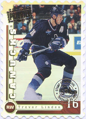
LINDEN CARD OF THE WEEK - 1997/98 Donruss Priority Stamp Of Approval

This week's Trevor Linden card goes down as one of my favorite numbered parallel cards. Eye-catching (trust me, the scan does not do it justice).


1997/98 Donruss Priority
Stamp of Approval /100


The regular issue of this card was a short-printed card in the set and the parallel was even tougher to track down. The first time I saw it though (on ebay), I knew that I'd be the winning bidder.

It's a gorgeous design for a card with the die-cut "stamp" feel (I've seen it done before and since - and not nearly as impressive - but this one was bang on) and silver reflective surface...which apparently scans horribly.

It's cards like this that make me go back into my Linden collection over and over and really enjoy looking at the cards. I know a lot of collectors that get their cards and simply put them in a box and put it into a closet. For them (and for me) a big part of the collecting is the hunt for the item.

I'm lucky enough to have that extra added value....I often go back and enjoy the cards I've acquired.

Thanks for taking a look.

Tuesday, November 3, 2009

ONE SHEET, ONE SET - 2006/07 Hot Prospects

This week, I'm taking a look at a newer set. Well, it's new to me seeing as Trevor Linden wasn't in the set. I was kindly given a box of base cards back a while ago and these were in there. They caught my eye and so here we go.


2006/07 Hot Prospects

A trend with a lot of recent card releases is that there is no variety when it comes to player shots. Meaning, for example here, they are all 3/4 body shots. Not that that's a bad thing, but I will say, I enjoy sets more that have a wider variety of photography.

This base set has 100 cards in it. There are 102 more cards officially in the 202 card release, but cards 101-202 are short print, serial numbered....so I'm not including them.

Another thing I like about these cards is that they are on a little thicker card stock and it has a glossier finish. It just makes the cards look and feel a little slicker.


Taking a closer look at the front of the card, you can see immediately that there is a color scheme going on. In addition to the name bar, the background of the shot is tinted in the team color. A nice subtle touch in my opinion.

A fairly simple design with good flow. The background shapes work quite nicely together and the top, main and bottom sections blend well.

The name bar is unique and creates the effect of the name sitting on top of the background. The texture on the upper portion of the name plate as well as the lower team name area is subtle, but nice.

The HP logo is a little hokey for me. I would have preferred a team logo or something. As well, I'm not completely sold on the "Hot Prospects" name across the top. Again, it looks like empty space that they needed to put something into.

One thing I didn't even notice until I scanned the card, the position of the player is in the corner of the background. When looking at the card, it gets lost real easy. A waste if you ask me.


The back of the card ignores cardinal rule #1...do not use the same photo on the back of the card as you do on the front. That just kills me - especially for this set. A nice extreme closeup of the player's face (or mask) would look awesome.

The text font style is consistent with the front and looks sharp - simple, but sharp. Another beef of mine is incomplete stats. You only get the last 3 year's worth...that's it. Some quirky "did you know" stuff at the bottom and a plethora of logos rounds out the back.

Overall, I like the set. I think the photography is sharp (even if it is limiting) and the layout is solid. A few pet peeves costs it style points.

For those looking to build the 100 card set. It shouldn't be too hard. The set is only a few years old and singles for it should still be readily available. I'd be willing to bet that a set could be built for under $10 (The Ovechkin and Crosby cards demand the highest price...and probably will be sitting in the dollar box at best).

3.5 masks out of 5

CARDBOARD PHOTOGRAPHY - Ed Belfour

Here's a card I came across while searching for some goalie mask cards. I thought it would make a great candidate for this section.

2003/04 Upper Deck Ed Belfour #184

Much like the Martin Brodeur card from a couple weeks ago, I gotta say - I love technology.

A shot like this wouldn't have existed 30 years ago (a shame, since I can only imagine what kind of shots could have been had with the vintage masks).

The "net cam" shot has been used for years on television when it comes to replays and officials checking the play. From a photographic and hockey card sense, they've been using this angle for over a decade now.

At first, I loved the shot. It was new and unique. Something different. But much like hockey cards in the 90's, oversaturation killed the allure. Now when I see a "net cam" shot, I barely blink.

This card is different though. It's not an action shot, it's not a goal, it's not a "let's get ready for the faceoff" shot. It's a simple stretch, but it turned an overused shot into a creative piece of cardboard.

I just wonder if Belfour knew the camera was there and that his picture was being taken or not (he is looking right into the camera).

BEHIND THE MASKS - Different Types of Masks

Well, I promised you guys an article on the history of the goalie mask. Unfortunately, that will have to wait for a bit. I've decided that I'm going to do an article on it for a magazine. Therefore, it will take a little longer for me to put together. Fear not though, it will come soon.

In the meantime, I will give you a different goalie mask post. This one will take a look at the different kind of masks out there.

Enjoy.

The "Intimidation" mask


The "Tribute" mask


The white "I Just Got Traded" mask


The "Hidden Messages" mask
(let me know if you know what it is)


The "Huh, I Didn't Know He Wore That" mask


The "I Hope You Didn't Pay Too Much For That...
You Won't Be Here Long" mask


The "My Mask Is Better Than Me" mask


The "What Team Do I Play For...
Wait, I'll Just Check My Mask" mask


The "I Wish I Didn't Get Traded Cause
I Had A Cool Looking Mask" mask


The "Hey! Get Back To Wearing Your
Chris Osgood Mask" mask


The "I'm Only Remembered
Because Of My Mask" mask


The "I Can't Believe They Didn't Make A Card
Of The Coolest Mask Of All Time" mask


The "Chris Osgood" mask
(note: It's a helmet....not a mask!)

Sunday, November 1, 2009

BEHIND THE MASKS - It Was 50 Years Ago

November 1 marked the 50th Anniversary of Jacques Plante donning the goalie mask. His bold move (at the time) revolutionized the way the position was played and saved a lot of players a lot of stitches.

My intention was to do a story on the anniversary, but sadly I was working for most of the day. I will do my best to put the piece together over the next day or two.

I hope everyone had a chance to read some interesting articles or watch some good features and/or documentaries on the subject.

The NHL Network had two hour long docs on the mask. I taped them....so don't ruin it for me. You can check out one of the docs below at nhl.com. Enjoy.


Just a heads up...I am having problems connecting to the video (possibly the demand is too high). If you are having troubles, you might have to navigate to nhl.com and go to the video section directly (just click the "NHL Network Online" words at the top right of the screen.

THE YEAR IN CARDS - Week 5

This week I found some great photos. I really like the selection. That said, I'm starting to recognize that some teams haven't been represented. I am trying not to let that affect my decision. I want THE moment from the night.

Enjoy.


Year In Cards - oct31a


Year In Cards - oct31b


Year In Cards - oct30a


Year In Cards - oct30b


Year In Cards - oct29a


Year In Cards - oct29b


Year In Cards - oct28a


Year In Cards - oct28b


Year In Cards - oct27a


Year In Cards - oct27b


Year In Cards - oct26a


Year In Cards - oct26b


Year In Cards - nov1a


Year In Cards - oct31a