Saturday, November 5, 2016

LINDEN CARD(s) OF THE WEEK - Card Show Pickups

After a nice relaxing day puttering around the house (in anticipation of a busy couple weeks at work) I decided to sit down and watch the Leafs/Canucks matchup.

Yucky.

So I figured that while I was watching the late game (Flames/Kings) I'd share some of my Linden pickups from last weekend's big card show.

Three new cards to add to the collection and the common theme with them all is that I didn't discover any of them myself.  It's nice to know that there are collectors out there who keep an eye out for me.  It's very much appreciated.

First up, this great jersey/stick piece from this season's UD Artifacts release.  Numbered to just 25 and with a nice looking stick piece, I was summoned over to another vendor's table to see the goods that a collector brought by.

I was immediately interested.

Not knowing what they went for in the open market, both the owner of the card and myself were a bit stumped as to what it should warrant.  I asked politely if I could do a bit of research so I could make a fair offer.

A quick peek on eBay at past sales and we quickly came to an agreement.  He was happy with the price (which I felt was very fair) and I was thrilled to add this card - my first Linden Artifacts card of the 2016/17 collecting season.

This Sega Genesis card......I mean Leaf Genesis is an eight-jersey common.  I mean, there are a lot more of these types of cards out there since the days of the Parkhurst True Colors team jersey cards.

But when a collector noticed it in a box (on a table I had yet to peruse) he immediately hollered at me to check it out.

I'm glad I did.  The seller was firm on his price and it was a fair ask.  Numbered to just 35, this is the most common of Franchise Legacy cards out there.  Hoo boy.

Actually, I'm glad to knock it off the list.  Any time I can add a Linden card like this locally it's a victory.  I don't know if I would have pulled the trigger so quickly on it had it been online.

Interesting note on this card...it's considerably shorter than the Artifacts card above.  Noticeably shorter.  As in...it would shift a bit in a one-touch holder.  Not sure if it's a miscue or what.  Anyone else notice this with your Sega Genesis cards?

Oh yeah.  This one is huge.  And I laughed when I was handed it.

A fellow collector popped by my table and calmly tossed it my way.  A gift.  He wondered why I was laughing.  He must not have read my post from last year's show.

I was really happy to add the white jersey piece to the collection.  I tend to collect the different color jersey pieces from Upper Deck flagship sets.  I like the way they look.  And this Linden jersey card really looks sharp.

So I did what only felt right.  I went back the next day with the extra blue jersey piece, in the identical holder I was given the day before, and handed the card back to him.  An upgrade in his mind and a correction on a mistake made a year ago.

Win-win.

I did pick up a fourth card but I don't want to show it as it's off in the mail to someone else.  I'm excited to get his reaction when he receives it.

So it was a simple Linden haul at the card show but one thing I've learned over the years is that Simple is better than none.


Thursday, November 3, 2016

PARKIE PROJECT - Two From The Big Show

I'm still in recovery mode from watching one of the most exciting baseball games sporting events I think I have ever witnessed - ever.  I went into this game thinking it could be something special (obviously....since there was a very long streak that was going to end) but never did expect so many twists and turns and moments of joy and despair all tied up into one incredible evening.  I was pulling for the Cubs and I was on the edge of my seat right until the end.  It was incredible.

So how do I segue from that to some old hockey cards I picked up at the big show last weekend?

Well.....they're old.  Just like the streak.

One of the goals I had at the biggest card show of the year was to land at least one 51/52 Parkie for my vintage project.  I found a couple perfect fits but also had my eye on one other piece that had me flip-flopping all Sunday afternoon.

But first....the new additions.

1951/52 Parkhurst
#100 Wally Hergesheimer

I had come across a table - a pretty empty table...literally....like about 20 or 30 cards - that had a pile of Parkies all in tough shape.  Most were creased, bent or had crap on the backside.  There was a poorly handwritten note (using the hotel stationary) next to it that said "Parkies $40 each".  No way any of those cards were worthy of a pair of $20 bills.

But I started to bend after a while.

There was one card, Wally, that started to look like it could be a part of the collection.  It had a small crease in the bottom left, but the corners were nice, the back was clean and just from an aesthetic standpoint....I thought it looked good.  But I was still struggling with the price.

The keeper of the card came over to look at my stuff and noticed a baseball cut signature.  It was a card I had for a while and was kind of worried that it would be tough to get rid of.  So I cut him a deal on it if he would cut me a deal on the Parkie.

I still feel like I slightly overpaid, but I'm ok with it.  I didn't have any buyer's remorse that night or the next day (a sure sign that a bad purchase was made) and I'm looking at the card now thinking that I did the right thing.

There's some great color on the card and as I mentioned, the corners are pretty nice (for my set parameters anyways).  A great add.

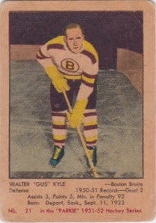
1951/52 Parkhurst
#21 Walter "Gus" Kyle

This was a nice bonus that I stumbled upon after seeing Captain Canuck pick up some nice vintage Habs cards.  Seeing what he had picked up from a table on the far end of the room made me take another look at what they had in their vintage box.  I had taken a look earlier but didn't see any 51/52 Parkies.  Seems I missed them.

There was only one that worked for me (the others were just in too rough of shape to consider) and the price was a little more reasonable than the Wally.  While the corners weren't as solid, the entering was pretty good, the back was again clean and, well....it's a Parkie.  You just don't see them too often locally.

So I struck a second time.  Good enough for me.


Now on to the card that had me going back and forth.

It was a really nice Max Bentley card - PSA 6.  And the price was fair in my opinion (under $100 cdn). But where I struggled was in the slab.

My collection doesn't consist of graded cards.  I know a lot of people building this set go for the PSA versions as they really reinforce the quality level, authenticity and price maintenance.  But I just didn't want to go into that world as I felt I would eventually want to build them all graded.

And I really wouldn't want to break it free from the slab as it would just diminish the value of the card should I ever want to re-sell it.

It was nice and it was the right price, but it just didn't fit the parameters of my collection.  So I passed. OK, actually the guy packed up his cards early and left so the decision was pretty much made for me (must have taken him forever to pack up all 20 of his cards).

So I left feeling good about my vintage pickups but it did leave me thinking if I am on the right road with my collection.  I think I am.  And I'm sure once I start venturing into the bigger ticket cards I'll be glad I'm building a set that is of this condition.  I don't know if I could build a high grade set of this age.

Hopefully I can land a few more over the next 12 months.  It was a rush adding these two to the pc.

Parkie Progress - 17 out of 105  (16.2%)

Monday, October 31, 2016

CARDBOARD PHOTOGRAPHY - Close...But No Cigar

You remember when the Canucks went retro for a game last season?  It was against Toronto.  I was pretty pumped to watch it as I lived and breathed the Canucks "skate logo".  And to see Ryan Miller come out with the full on V logo mask just brought back even more memories of the Canucks teams from the early 80's (and John Garrett).

So how did the hockey card world celebrate this great game, sweet uni and killer mask?  Well they had a beautiful shot of Miller stepping on the ice as the photo of choice for their Portfolio set.  Brutal.

Well this year Upper Deck looked to right that wrong by including Miller (in his retro garb) in their robust OPC set.  It was great to see.....almost.

Once again....close but no cigar.

So I guess I'll have to do things myself.

You know the saying, if you want something done right.......

There.  Now was that so hard?

Now while I'd love to see a little more of an action shot (yes, I'm picky), this card of Miller would be the Ace of Spades in anyone's retro collection.

Man that's a great looking mask.

Sunday, October 30, 2016

WALLET CARD - A Pretty Big One

What a great finish to the weekend.  I set up at my first card show in a year and it was tremendous.  Got rid of a lot of stuff (some of it I have had for a number of years), picked up a couple cards for different PCs (show & tells to come) and just the overall vibe and conversations were just what I want in a show.

I teamed up with Captain Canuck, splitting a table, and it was just right.  I was able to get around to the other tables, check out their wares and still feel comfortable with what I was leaving on my table.  It's totally the way to go.

Now in addition to the card show, it's been a great weekend for sports.  Football is in full swing, hockey is just ramping up and oh, by the way, the World Series is on.  I'm currently watching the Cubs trying to stave off elimination and they've just gone out in front.  I hope it's a 7-game series and that it's a crazy finish.  After the last couple games it's starting to feel a little anti-climatic.

So with the Indians and Cubs currently playing, I thought I'd share some of my #WalletCard pickups of late.  Did you know that Oscar played for both teams?  I wonder who he's rooting for this fall?

I've once again asked for the help of a fellow collector (who has a US address) to snag a few cards for me.  And I'm really glad he did.  The first one is a pretty big one for the collection.

2013 Panini Hometown Heroes
#HSOG Hometown Signatures Black  1/1

That's right....it's a bonafide 1/1.  The first one to hit my collection (and the first one I've seen on the open market since I started collecting Oscar Gamble cards a couple years ago).

I was pretty excited when I saw it pop up on my daily eBay searches and was even more excited at the conservative starting price.  I quickly asked for help and may have come across a little giddy.  It was a good laugh and he prepped a bid.

Much to my shock, the opening bid was also the winning bid.  I've never experienced that before.  Throughout my Linden travels I have never seen a true 1/1 not get any sort of competition.

So a very inexpensive 1/1 was coming my way.

Here's the back of the card to savour the fine silver 1/1 foil stamp.  Very nice.

But that was not the only card to arrive in the package for my #WalletCard project.  And who am I to not give the other cards their proper due.

So without further ado....

1984 Nestle #512

This is the infamous "Richard Pryor" card as I so lovingly refer to it....but the food issue parallel.  This card was part of a 792 card promotional set that was only made available in uncut sheets.  Seeing the single cards mean that they were hand cut (professionally of course).

Regardless, I like the variation and am happy to knock off this inexpensive parallel.

1985 Topps Traded #37T

This is both a great looking card and a nasty one.  I loved this White Sox uniform as a kid but am bummed by the simple head shot.  You just don't get the full glory of the uni.

This Topps Traded card is designated as such by the card number on the back.  I was surprised to see the green back being so vibrant.  For a moment I thought I had the Tiffany version...but the front is not shiny.

1990 T/M Senior League #37

This piece of cardboard feels less like a baseball card and more like a bad family outing photo.  Is this guy really a baseball player?  Is this guy really Oscar Gamble?  It says so on the card but I'm not buying it.

The card is nicely miscut (cropping a little too much off the top) but it's par for the course as all the copies I've seen look the same.

The team depicted....the St. Lucie Legends.  The card lists some career stats on the back.

Games Played - 1584
Hits - 1195
Home Runs - 200
Average - .265

Nothing amazing, but Oscar carved out a nice 17-year playing career.

So that's them.  These cards push my #WalletCard collection to 49 (oh so close to the milestone).  And technically I have already surpassed it as I have a half dozen cards waiting for me on COMC.  I may have to get them delivered before Christmas.

Heck, the more I go through these cards, the more I feel like every addition is a pretty big one.  That's what I love about this project.  It's just sheer fun.

Wednesday, October 19, 2016

RATE MY MASK - Robin Lehner

I was at the Calgary Flames game tonight and was struck by what I saw in the opposition net.

I usually am curious to see what goalie masks are being sported and if I like them or not.  To me, a good looking goalie mask should be one that can be appreciated both up close and from a distance.  But in Robin Lehner's case, I had to do a little more digging as you will soon realize.

No, I didn't desaturate the photo, this mask is completely black and white.  Can something so devoid of color be considered bold?  Possibly.

My first thought was that of another goalie who went sans color in their mask design...Tim Thomas.  In fact, he was my very first "Rate My Mask" card and a quick peek shows that I gave it a 4 out of 5.  But many of you didn't feel so kind to it at the time.

We'll see how you feel about Lehner's.

Drawn up by mask design guru David Gunnarsson, this creation is entitled "The Cradle of Creativity" and is inspired by Robin's favourite band - In Flames.  We will get to some of that detail in a moment.

You can clearly see the Buffalo text running down each side of the mask with the In Flames logo on top.  The Sabres logo is on each side of the chin with the number 40 smack dab in the middle.

On the left side around the ear you will see what looks like a crow.  That part is inspired from In Flames' album cover for 'Sounds of a Playground Fading'.  It's quite small and doesn't really have the killer detail that the album cover has.

I like the artwork of this album.  And seeing this makes me understand more why it would work on Lehner's mask as a sketch.  I just don't know if the mask detail is as solid as it should be.

Now before I go any further, can you guess what music genre In Flames belongs to?

I'll give you a hint......you're right.

It's kind of catchy but it doesn't really do it for me.  But then again I've only listened to about a minute of their stuff.  First impressions....they can be a killer.

Anyways, back to the mask at hand.

The right side design, again by the ear, is....you guessed it, more album artwork inspiration.  This time from the 'Come Clarity' title.

Again, I can see why Gunnarsson went the sketch route.  But just like the other side, the detail of the album cover isn't quite as effective on the mask.  It just comes up short.

I don't know if that is because the artwork is so small (and actually pretty insignificant) in the overall design of the mask or that is really does look like a rough sketch drawing of it.  Regardless, it doesn't work for me.

Lastly, the rear panel sections of the mask showcase the mascot for In Flames.  This time, the detail is pretty effective.  It's got that maniacal laugh vibe that really puts some character into the mask.

While I enjoy masks that have an inspiration, theme or direct tribute, I do feel like there needs to be some character to the lid or it's nothing more than plain artwork.  And as detailed and impressive as it might be, if it lacks that soul...it really doesn't do anything.

The mascot depiction definitely adds to the mask.  In fact, I'd almost say that it saves it from really tanking in my overall rating.

So how did Gunnarsson and Lehner come to the decision to go with a sketch look?  It seems that the pair just got talking about how much they liked sketches and then Lehner mentioned that he wanted his mask to be like nothing ever done before.  He wanted to be completely unique.

He's got points in that category.

But is it enough to really impress?  When you pair it up with his dark jersey colours, the mask seems a little out of sorts.  Tonight when I saw him in net, the Sabres were wearing their road whites so it worked a little better.  That said, from a distance you couldn't really appreciate any of the design.  He looked more like a goalie who had to resort to the "I just got traded" white mask (now those are some sweet mask looks).

Overall, I like the attempt and the reasoning, but I just can't give it top marks.  It's not as detailed as I'd like in some areas and the "wow factor" is just not there when sitting in the stands.

2.5 out of 5

Now it's your turn to RATE MY MASK!!

BTW.....German Heavy Metal is the right answer.

Saturday, October 15, 2016

MY COLLECTION - 87/88 Canucks Puck...Candle

It was yet another trade night this past week (I always look forward to those) and while I wasn't too active a buyer I did walk away with a neat item.

The shop owner mentioned he had spotted this on his most recent trip out to BC and immediately thought of me. (Aw shucks)  He also noted that while it was not anything Linden related, I might just appreciate it.

He was right.

First off...hello yellow!!

I really think the NHL should use pucks like this all the time.  Could you imagine one of these flying into the crowd?  Now that would be a souvenir.

Now I'm sure you see it (as did I) - why isn't the puck quite round?

Well, this is the 87/88 edition of the puck candle.  I don't know if there are any 0other editions of it, but this one does the trick.

I'm choosing to not unwrap it in case it has some nasty 30-year-old wax stench.

Plus it is hard as a rock....it was dropped on more than one occasion and I can't believe it didn't break something - like my toe.

I can make out quite a few of the names like Stan Smyl, Petri Skriko, Jim Benning and good ol' Frank Caprice.

But one manufactured sig had me grinning.

If I'm not mistaken, that's Kirk McLean.

And I've got to think that it's one of his fist "appearances" on any sort of Canucks memorabilia.

That's pretty cool.

So a hearty 'Thank You' to Darren for thinking of me (he also included an old Linden food issue card). The puck candle is much appreciated.....and dare I say wick-ed.

Thursday, October 6, 2016

PACK RIPPING - 2016 Canada Post Souvenir Sheets Forwards

For the third year in a row, Canada Post got their hook in me.

Back in 2014 it was the Original Six stamp collection.  In 2015, the goalies took centre stage.

This year it's a great set of forwards that has me digging in the wallet for my extra change.

Canada Post has done a great job of putting together a progressive set - they work as individual products but marry well when you put them all together.  Six card-sized stamps of the best in the biz.

Let's stop with the chit chat and get to some scans.

I love the wrapper concept.  Makes it feel like there's an air of the unknown.  And actually ...there is.

Sure, you get six stamps (and you know which six you are getting since there are only six in the collection), but one in every 40 packs have a signed stamp.  Sah-wheet.

Sid the Kid is a great way to kick off this product.  Could you imagine hitting an auto of this gem?

Apparently the Crosby is a short print...no surprise there.

I really have enjoyed the stamp design used each year.  Nothing groundbreaking, but that's what I want in a product like this where there should be a hint of tradition and simplicity.  And....well, it's a stamp. Stamps just look cool.

But I dare not peel these to expose the coolness.  These sets will stay intact.

Yes!!  Finally, a photo of Lafleur that is more in line with the guy I remember tearing up the league in the late 70's/early 80's.

No helmet, no Rangers jersey, nothing but simple Montreal greatness.

Hoo boy.  From the penthouse to the outhouse.

Thankfully he's in an Oilers jersey.  I really don't know if I could have supported a product with this guy in a Rangers jersey.

Would've been a cooler stamp if he was in his blues.

Fantastic Phil.  Same deal here.  Why not in the black and gold?

Still, a great selection.

Helmet fail!!!!

At least he's not wearing Cooperalls.


Last but definitely not least, Stevie Y.

A great collection of players - and an even more fantastic chase for those autos.  Any of those would be gems in a collection.


Gotta think the defencemen are next up in 2017.  I'll be looking forward to it.  But where to go after that?  Could you do expansion or defunct teams?  How tremendous would this be.....

I.  Am.  In.